Master the Art of Color Matching: Unlock Your Perfect Palette! 🎨✨
Are you tired of clashing colors and fashion faux pas? It's time to elevate your style game by mastering the art of color matching. Whether you're dressing up for a special occasion or designing your living space, knowing how to create stunning color combinations can make all the difference. Let's dive into the secrets of flawless color matching and discover how you can unlock your perfect palette.
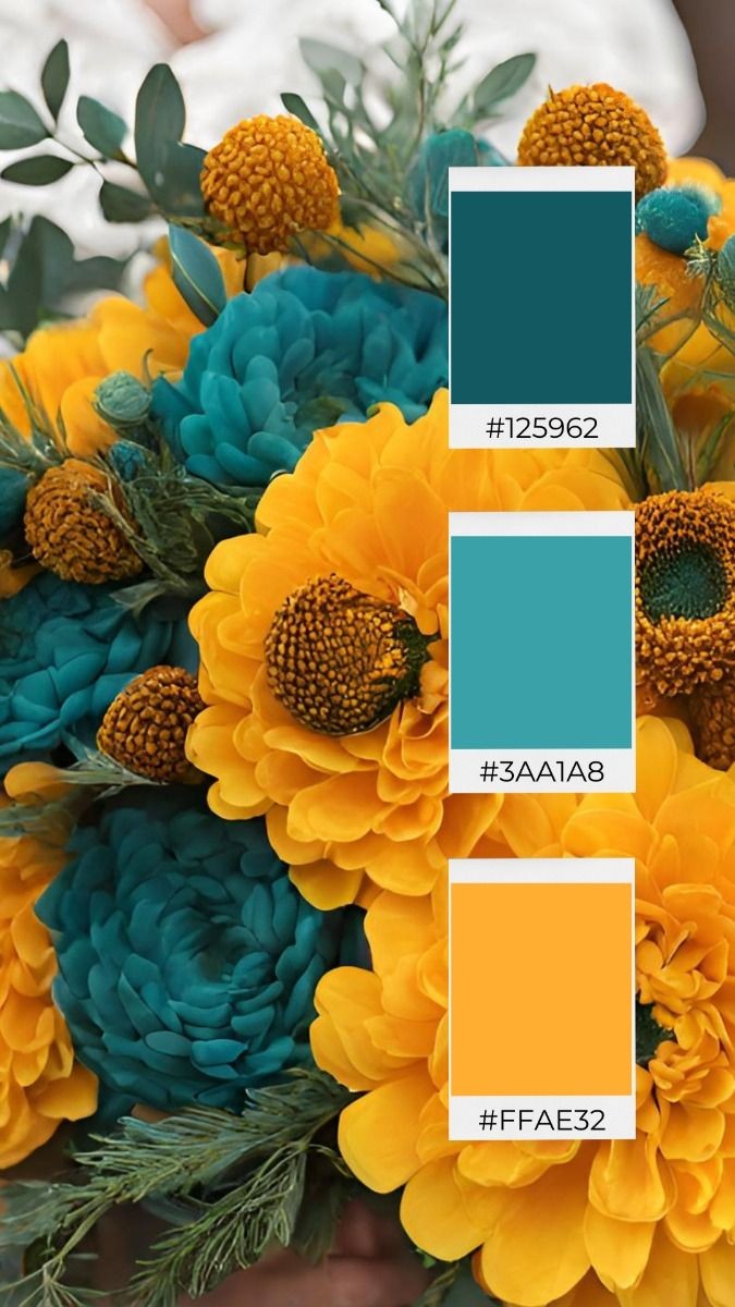
Understanding Color Theory
Before we get into the nitty-gritty of color matching, it's essential to understand the basics of color theory. The color wheel is your best friend when it comes to finding harmonious color combinations. Here are a few key terms to know:
Primary Colors: Red, blue, and yellow. These colors cannot be created by mixing other colors.
Secondary Colors: Green, orange, and purple. These are made by mixing two primary colors.
Tertiary Colors: Colors formed by mixing a primary color with a secondary color.
Types of Color Schemes
Now that you know the basics, let's explore different types of color schemes that can help you create visually appealing combinations.
1. Monochromatic:
A monochromatic color scheme involves using different shades, tints, and tones of a single color. This approach creates a harmonious and elegant look, perfect for both fashion and interior design.
Example: Pairing a navy blue dress with light blue accessories and deep blue shoes.
2. Analogous:
Analogous color schemes use colors that are next to each other on the color wheel. These combinations are pleasing to the eye and create a serene and comfortable design.
Example: Combining shades of pink, red, and orange for a warm, cohesive outfit.
3. Complementary:
Complementary colors are opposite each other on the color wheel. When paired together, they create a vibrant and high-contrast look that can make any design pop.
Example: Wearing a purple top with a yellow skirt for a bold and eye-catching ensemble.
4. Triadic:
A triadic color scheme involves using three colors that are evenly spaced around the color wheel. This combination is balanced and lively, adding a dynamic touch to your style.
Example: Combining red, blue, and yellow in an outfit or room design for a playful and energetic vibe.
Practical Tips for Color Matching
1. Start with a Neutral Base:
Neutrals like black, white, gray, and beige are versatile and can be paired with almost any color. Use them as a foundation and build your color scheme around them.
2. Consider the Occasion:
Different occasions call for different color schemes. For formal events, stick to classic combinations like black and white or navy and gold. For casual outings, feel free to experiment with bolder and more playful colors.
3. Use the 60-30-10 Rule:
This interior design rule can be applied to fashion as well. Use 60% of a dominant color, 30% of a secondary color, and 10% of an accent color. This creates a balanced and visually appealing look.
4. Pay Attention to Skin Tone:
When choosing colors for your wardrobe, consider your skin tone. Warm skin tones look best in earthy colors like reds, oranges, and yellows, while cool skin tones shine in blues, greens, and purples.
5. Experiment with Patterns:
Don't be afraid to mix patterns, but make sure they share a common color to tie the look together. This creates a cohesive yet interesting design.
Tools for Color Matching
There are plenty of tools available to help you with color matching. Color palette generators, apps, and websites can provide inspiration and help you visualize different combinations. Some popular tools include:
Adobe Color: Create and explore color palettes.
Pantone Color Finder: Find the perfect color and its complementary shades.
Coolors: Generate infinite color schemes for your projects.
Conclusion
Mastering the art of color matching can transform your style and elevate your design skills. By understanding color theory, experimenting with different color schemes, and using practical tips, you can create stunning combinations that turn heads and captivate attention. So, dive into the world of colors, unlock your perfect palette, and become a color-matching pro!
#colorbalance