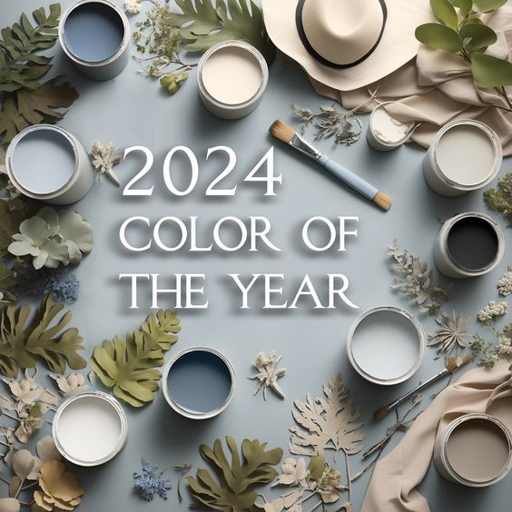
2024 Color of the Year: Transform Your Home with SW Upward and Its Perfect Coordinating Colors
Every year, color experts and interior designers eagerly anticipate the announcement of the Color of the Year, a shade that sets the tone for design trends in homes across the globe. For 2024, Sherwin-Williams has named SW Upward (SW 6239) as the Color of the Year. This serene and versatile hue is poised to be a favorite for homeowners and designers alike. Whether you’re planning to refresh a single room or redecorate your entire home, SW Upward and its coordinating colors offer endless possibilities for creating a cohesive and stylish space.
What is SW Upward?
SW Upward is a soft, muted blue with subtle gray undertones, making it an incredibly versatile choice for a variety of spaces and styles. It evokes a sense of calm and tranquility, reminiscent of a clear sky at dawn. This color works beautifully in both modern and traditional settings, offering a fresh yet timeless look.
Mood and Atmosphere: SW Upward brings a peaceful and soothing ambiance to any room. Its cool tones make it ideal for creating restful spaces, such as bedrooms, living rooms, or home offices.
Versatility: This hue pairs well with a wide range of colors and materials, from warm woods to cool metals, making it easy to integrate into your existing decor or inspire a complete redesign.
Coordinating Colors for SW Upward
To make the most of SW Upward, it’s essential to pair it with the right coordinating colors. Sherwin-Williams has curated a palette that perfectly complements this year’s star shade, ensuring a harmonious flow throughout your home.
SW Pure White (SW 7005)
Description: A crisp, clean white that provides a bright, neutral backdrop.
Usage: Use SW Pure White for trim, ceilings, or cabinetry to create contrast and highlight SW Upward’s soft blue tones. It also works well on walls in spaces where you want to maximize light and space.
SW Naval (SW 6244)
Description: A deep, rich navy that adds depth and sophistication.
Usage: SW Naval pairs beautifully with SW Upward for a bold, yet cohesive look. Consider using it for accent walls, built-in shelves, or as a statement color for furniture pieces.
SW Repose Gray (SW 7015)
Description: A warm, versatile gray with subtle taupe undertones.
Usage: This gray works well in spaces where you want to add warmth while keeping a neutral palette. It complements SW Upward in living rooms, dining areas, or hallways, creating a seamless transition between rooms.
SW Evergreen Fog (SW 913
Description: A soft, earthy green with hints of gray, perfect for bringing nature indoors.
Usage: Pair SW Upward with SW Evergreen Fog for a natural, calming palette. This combination is ideal for bedrooms, bathrooms, or any space where you want to evoke a sense of serenity and connection with nature.
SW Urbane Bronze (SW 7048)
Description: A dark, sophisticated bronze with a hint of warm gray.
Usage: SW Urbane Bronze adds a touch of elegance and modernity when used as an accent color with SW Upward. Consider it for feature walls, kitchen islands, or even exterior accents like shutters or doors.
How to Use SW Upward and Its Coordinating Colors in Your Home
1. Whole-House Paint Scheme For a cohesive look throughout your home, consider using SW Upward as the primary wall color, with its coordinating shades as accents in different rooms. This approach ensures a smooth flow from one space to the next, creating a unified and harmonious design.
Living Room: Paint the walls in SW Upward, and use SW Pure White for trim and built-ins. Add SW Naval as an accent on the fireplace or feature wall for a sophisticated touch.
Kitchen: Use SW Pure White on cabinets and SW Repose Gray on the walls. Add a pop of SW Urbane Bronze on the island or lower cabinets for a stylish contrast.
Bedroom: Create a serene retreat by pairing SW Upward on the walls with SW Evergreen Fog in bedding and decor. Use SW Naval for a bold accent on the headboard or an adjacent wall.
2. Accent Walls and Statement Pieces If you’re not ready to commit to SW Upward on every wall, consider using it as an accent color. Pair it with SW Pure White or SW Repose Gray for a subtle look, or go bold with SW Naval or SW Urbane Bronze.
Feature Wall: Paint one wall in SW Upward to draw attention and create a focal point in your living room or bedroom. Complement it with neutral furnishings and decor to let the color shine.
Furniture and Decor: Incorporate SW Upward in furniture pieces, such as an accent chair or coffee table, or in smaller decor items like throw pillows, rugs, or artwork.
3. Exterior Applications SW Upward isn’t just for interiors—it can also make a beautiful statement on your home’s exterior. Use it for siding, shutters, or doors, and pair it with SW Pure White for trim and SW Urbane Bronze for architectural details.
Front Door: Make a welcoming statement with a front door painted in SW Upward. Pair it with SW Pure White trim and SW Naval shutters for a classic, elegant look.
Exterior Siding: For a modern farmhouse feel, use SW Upward on your home’s siding, with SW Repose Gray for trim and SW Urbane Bronze for accents.
Conclusion
SW Upward, the 2024 Color of the Year, offers endless possibilities for transforming your home with its soft, calming tones and versatility. Whether you’re looking to create a serene retreat, a bold statement, or a cohesive whole-house color scheme, SW Upward and its coordinating colors provide the perfect palette. Embrace this tranquil hue and its complementary shades to refresh your space and stay ahead of the latest design trends.