The Illusion of Distortion: A Minimalist Door that Plays Tricks on the Eye
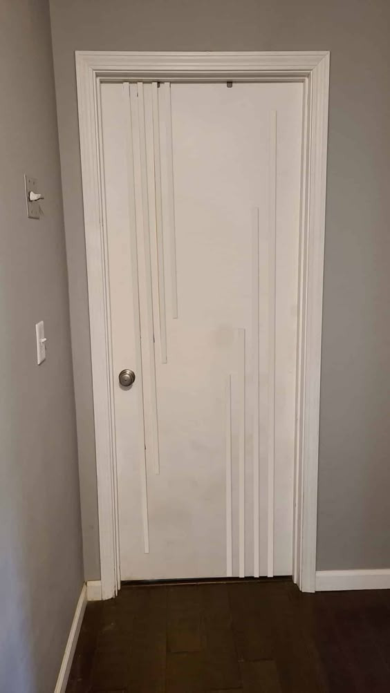
In the vast realm of interior design, creativity often finds its most compelling expression in subtle details that invite a second glance. The image presented showcases a rather unassuming door — white, minimalist, and nestled within a neutral-toned hallway. At first glance, it might seem like an ordinary door, but a closer inspection reveals something extraordinary. The visual illusion it creates is both clever and disorienting. The vertical grooves or painted strips on the door mimic the outline of the doorframe and wall panels, giving an impression that the frame itself is warped or melting into the door. This is a brilliant example of how art and architecture can intersect in the most unexpected spaces — even on something as mundane as a door.
Understanding the Visual Trick
The door plays with vertical line patterns that appear to be misaligned fragments of the doorframe and adjacent wall. These lines don’t serve any structural function; they are purely aesthetic. However, their placement is far from random. They are meticulously aligned to simulate continuity with the doorframe, creating the illusion that the frame’s vertical elements are dripping or sinking into the door itself.
The use of monochromatic tones enhances this effect. By painting the lines in the same color as the surrounding trim (white), but extending them irregularly down the surface of the door, the eye is tricked into seeing the door and its frame as a single fluid object. This technique blurs the boundary between two distinct architectural components — the stationary frame and the moving door — making it hard to discern where one ends and the other begins.
This form of visual illusion isn’t just a design choice; it taps into principles of Gestalt psychology, where the mind fills in the blanks and tries to create continuity. The eye is naturally drawn to lines and seeks symmetry, so when that symmetry is manipulated, it creates cognitive dissonance — a brief moment of confusion and curiosity.
A Minimalist Masterpiece with a Twist
The elegance of the design lies in its simplicity. The overall color scheme is muted, dominated by grayscale and white. This choice ensures that the visual emphasis remains on the pattern itself rather than being distracted by vibrant hues or complex textures.
This is a brilliant example of minimalist design used not for starkness, but for storytelling. Unlike conventional minimalist doors that blend in and try not to draw attention, this one does the opposite — it becomes a focal point precisely because of its clever minimalism. There is no ornate detailing or vibrant pattern, just the quiet illusion of something being subtly off. It whispers instead of shouting, and yet it commands your attention.
Possible Inspirations and Artistic Context
This kind of design may have been inspired by the Op Art movement of the 1960s, where artists like Bridget Riley and Victor Vasarely created visual effects that moved or flickered in the viewer’s perception through clever use of geometry and contrast. Op Art relies heavily on the manipulation of the viewer’s visual perception, often using repetition and alignment to create motion or illusion.
Another possible influence is the Trompe-l'œil technique, a French term meaning “deceive the eye.” It refers to art that creates the optical illusion of three-dimensionality. This door might not employ full 3D illusion, but it certainly plays with depth perception and linear distortion, which is a modern, architectural cousin of Trompe-l'œil.
Function vs. Form: Is it Practical?
Some might ask: Is this practical? After all, doors serve a purpose, and design should not interfere with usability. But in this case, the illusion does not hinder function in any way. The handle is easily visible and accessible, and there’s no physical distortion of the frame or the door’s mechanics. The illusion is purely visual, leaving the functional aspects of the door untouched.
Moreover, this form of design makes perfect sense in homes, offices, or creative spaces that want to strike a balance between form and function. It’s a playful way to introduce personality into architecture without altering its fundamental purpose.
The Psychological Impact of Perceptual Play
This door design isn’t just about aesthetics; it’s a quiet psychological experiment. It encourages pause. In a world where we often rush past our surroundings, this kind of design demands attention — not through loud colors or eccentric shapes, but through subtle defiance of visual expectations.
It provokes curiosity. When someone first sees it, there’s likely a moment of hesitation, a double-take. “Is the frame bent?” “Why do those lines look off?” These questions linger in the mind, and that’s where the design succeeds most — it makes people think. It reminds us that even everyday objects can challenge perception.
There’s also a sense of humor embedded in the design. It’s a playful nudge to not take architectural norms too seriously. A door doesn’t always have to be a rectangle within a rectangle. It can be a canvas for visual mischief.
A Symbol of Modern Design Ethos
In many ways, this door is symbolic of contemporary design thinking. The modern aesthetic often values experiences over objects, emotion over ornamentation. This piece aligns with that ethos by transforming an object of function into an experience of perception. It’s not just a door; it’s a conversation starter, an art piece, a moment of visual surprise.
Additionally, it fits well within trends of “invisible design” — where elements are designed to blend, hide, or distort in a space — and “interactive design,” where the environment engages with the observer. Even though the door doesn’t physically move in a unique way, it moves the viewer’s thoughts and expectations.
Conclusion: More Than Just a Door
At first glance, this image might depict nothing more than a hallway with a slightly odd-looking door. But with further thought, it becomes clear that what we’re seeing is a masterclass in subtle visual storytelling. It challenges our assumptions about form and function, engages our perception, and invites us to see the familiar in an unfamiliar way.
This door exemplifies what modern interior design can be — intelligent, minimalist, thought-provoking, and even humorous. It doesn’t require expensive materials or elaborate craftsmanship; just a clever mind willing to bend the rules of visual expectation.
So the next time you look at a plain door, consider what else it might be. A canvas, a statement, or even a small rebellion against the ordinary. Sometimes, the most unassuming places are where the boldest ideas live.


